Platform: Responsive Web
Status: Live
Company: MRM//McCann
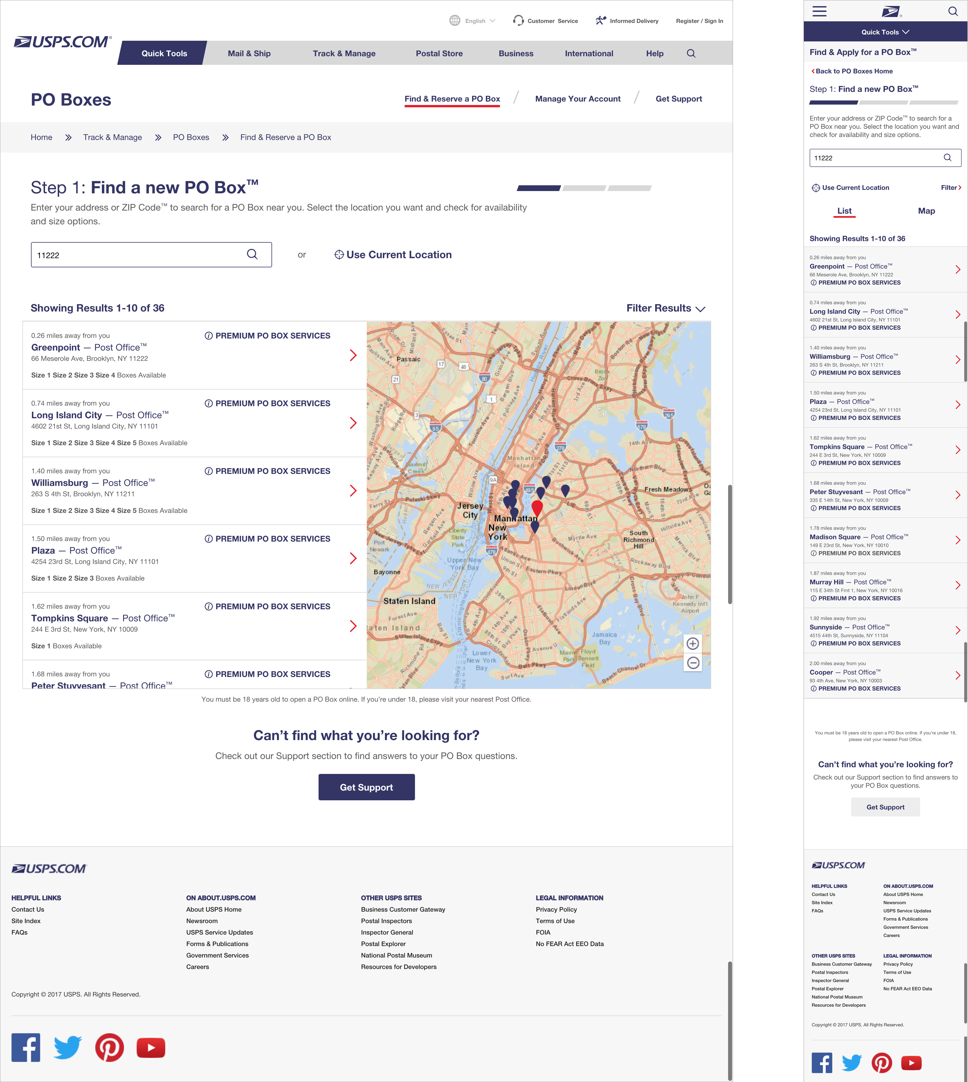
Updated and improved the UI to make buying and managing a PO Box easier. Added a larger FAQ section to make it easier to find information.

PO Boxes Online allows people to sign up, and manage their PO Boxes. The website had not been recently updated, and did not adhere to the current USPS Style Guide. We had the opportunity to introduce current interaction design standards, update the website to the USPS Style Guide, and introduce a couple small improvements.
Update a legacy site and introduce modern web interaction standards and practices, without significant changes to the back end, within a tight design and development timeline.
Update the site to improve the user experience within the capabilities of the existing back end. After improving the baseline user experience, examine longer term improvements.
Assisted with discovery tasks: timeline creation, client kickoff, strategic research and review.
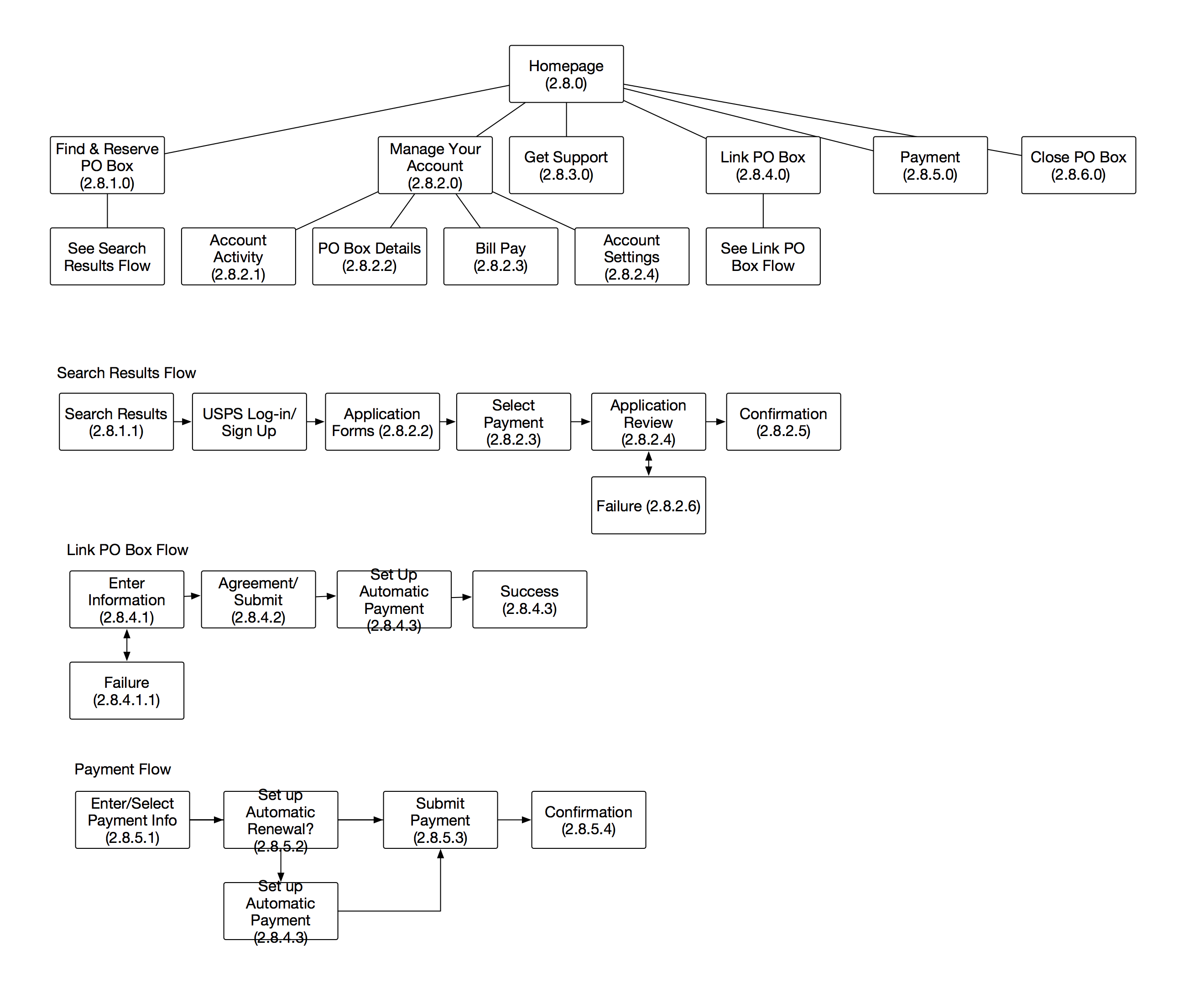
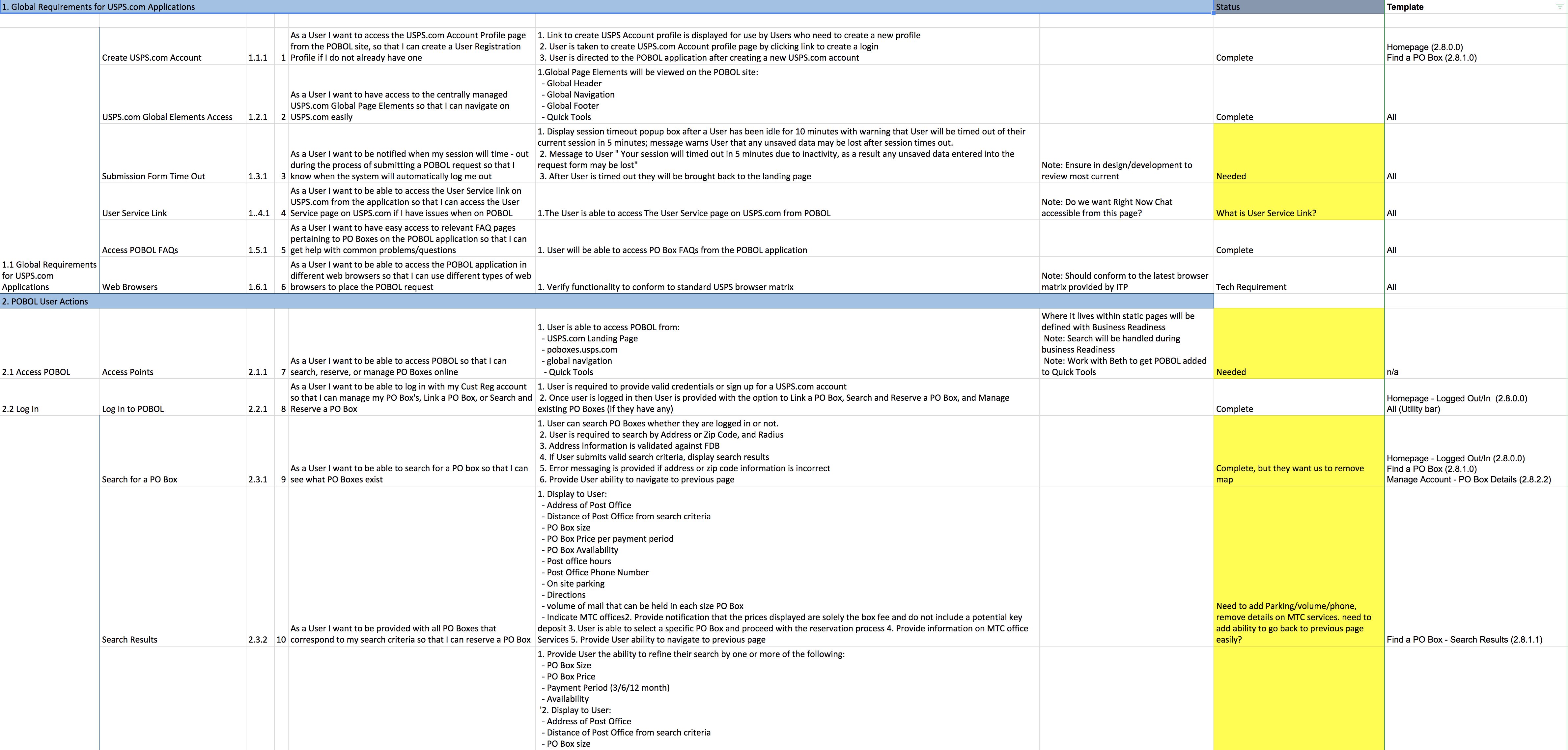
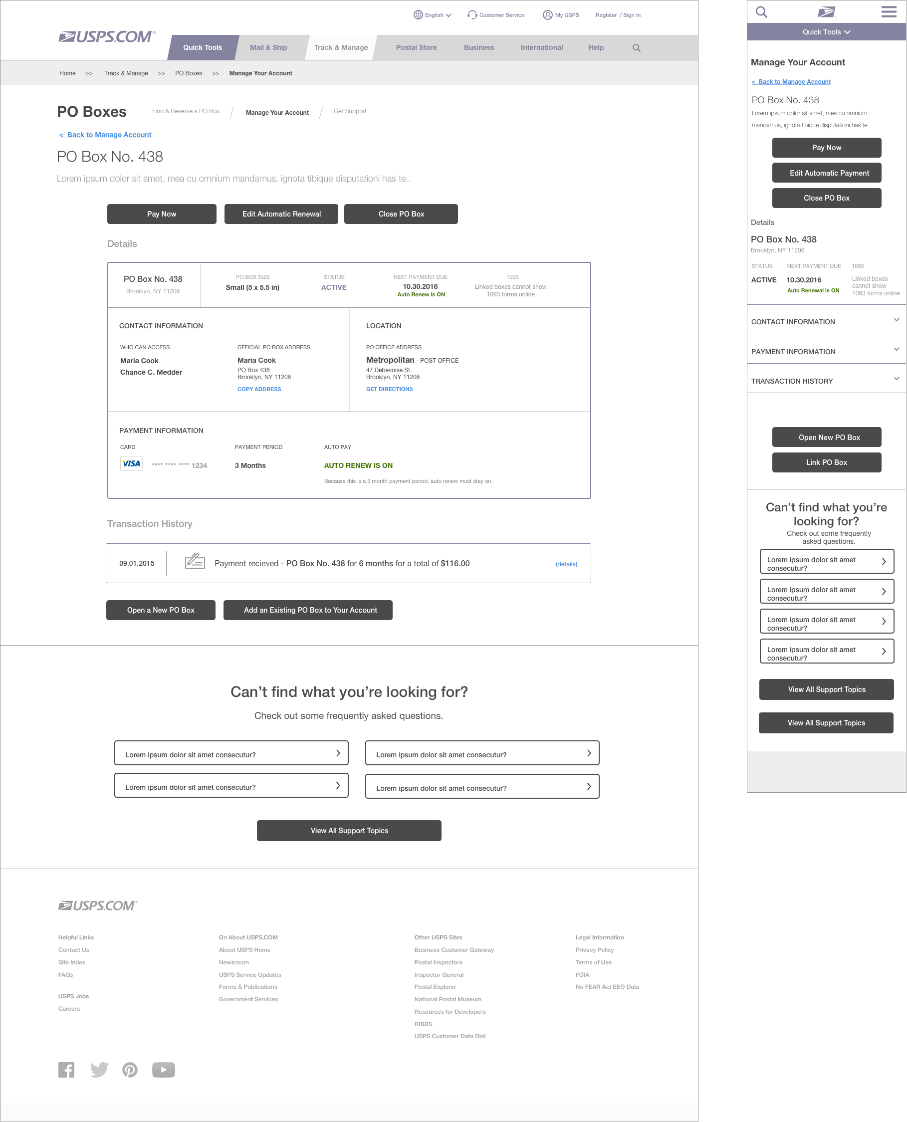
Defined site functionality: created user stories, acceptance criteria, and UX deliverables such as user flows and wireframes.
Led UX team: guided junior designers, presented work to the client, worked with the client to understand and synthesize feedback.
Worked with usability testing vendor to define usability test goals, and analyzed results for wireframe updates.


